Illustration
Illustration and painting have always been my most personal way of creating. Unlike advertising, where ideas usually need to answer a brief, drawing gives me the freedom to follow instinct. I’m drawn to minimal, organic forms — shapes that feel alive, imperfect, fluid and carefully composed.
I like the tension between control and spontaneity. A simple line can carry emotion, while an abstract shape can suggest a memory, a place, a body, a flower or a feeling. Painting takes that even further, giving me a physical connection to texture, gesture, layers and imperfections that become part of the piece.
My visual language usually lives somewhere between minimalism and nature, where softness and sharpness, order and chaos, beauty and discomfort can coexist. For me, illustration and painting are a way of returning to the most honest version of my eye — the one that creates without needing permission, strategy or a client presentation.
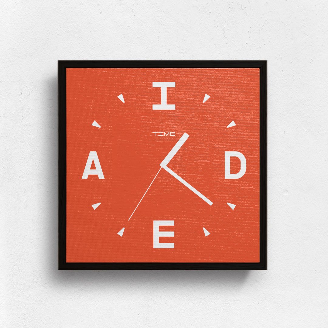
IDEA TIME is based on a simple belief: ideas don’t follow a schedule. They can appear at any moment, which is why a creative mind should always stay curious, observant and ready for the next spark.
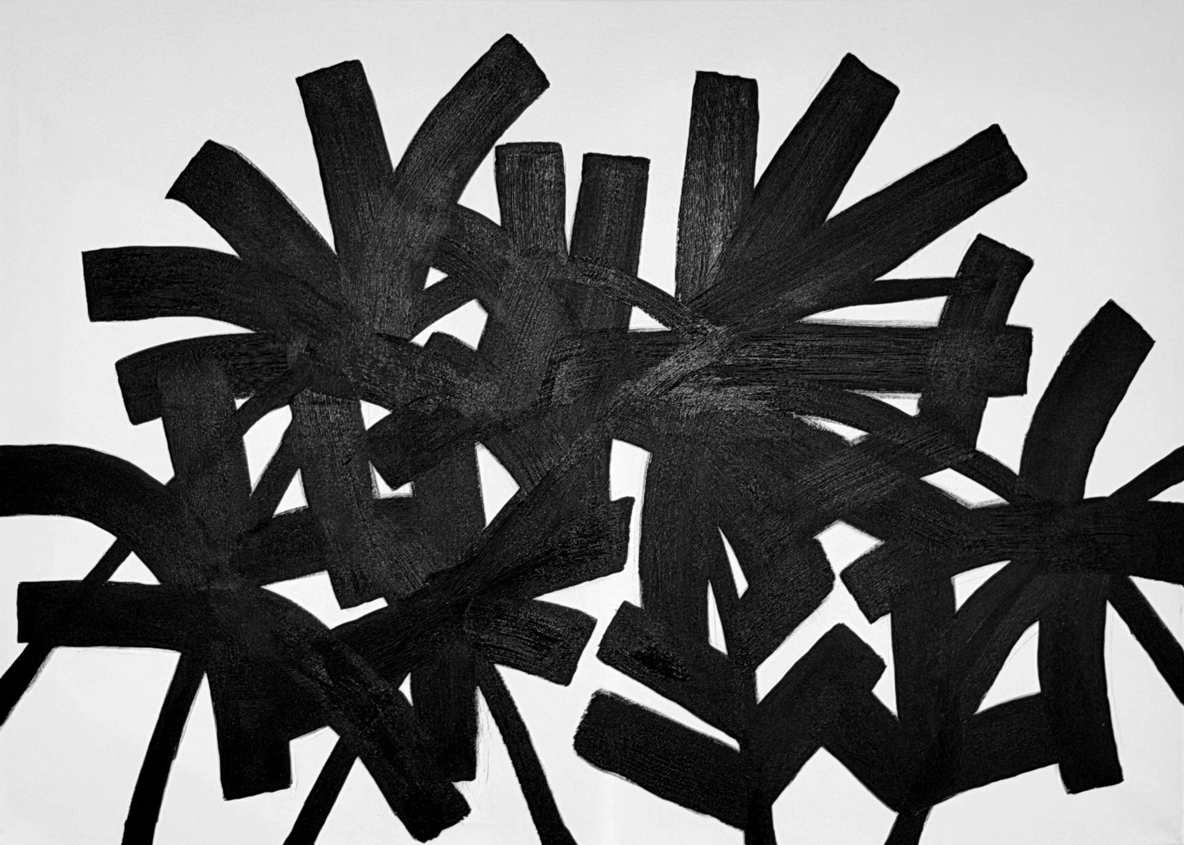
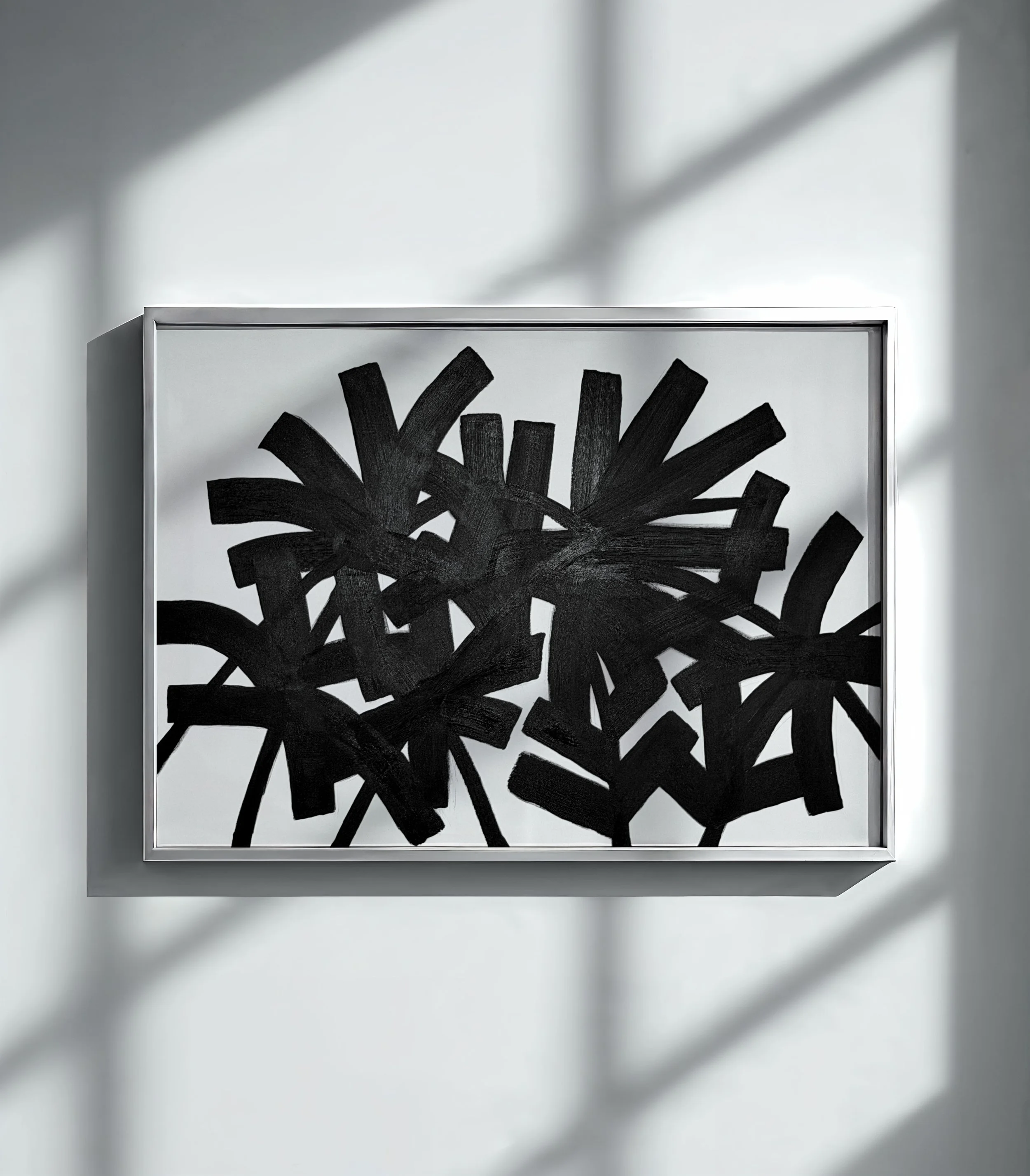
PALMS RHYTHM explores my fascination with palm trees and organic forms through bold black brushstrokes and high contrast. By abstracting plant-like shapes into repetition and overlap, the piece creates a textured pattern that feels both natural and graphic.
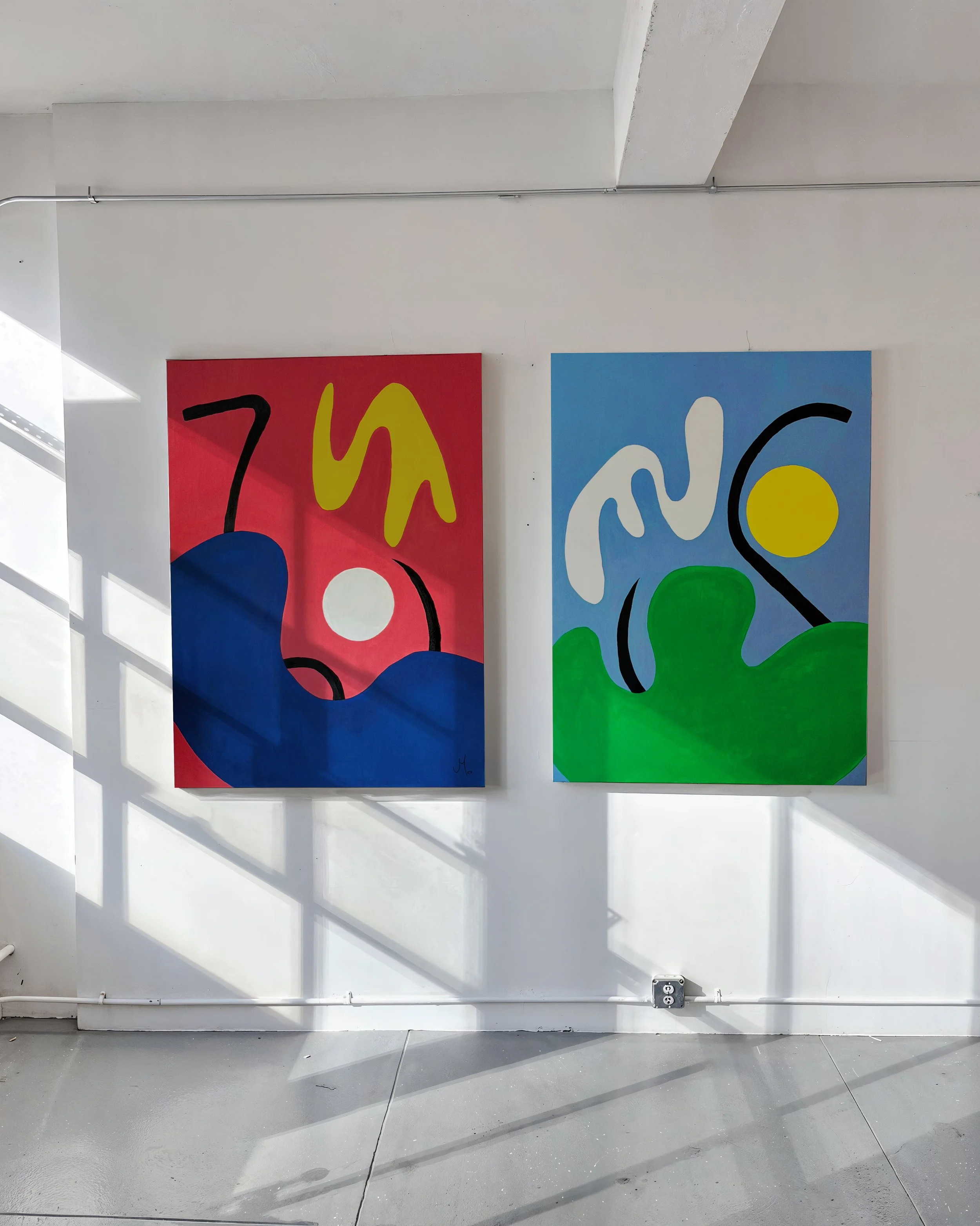
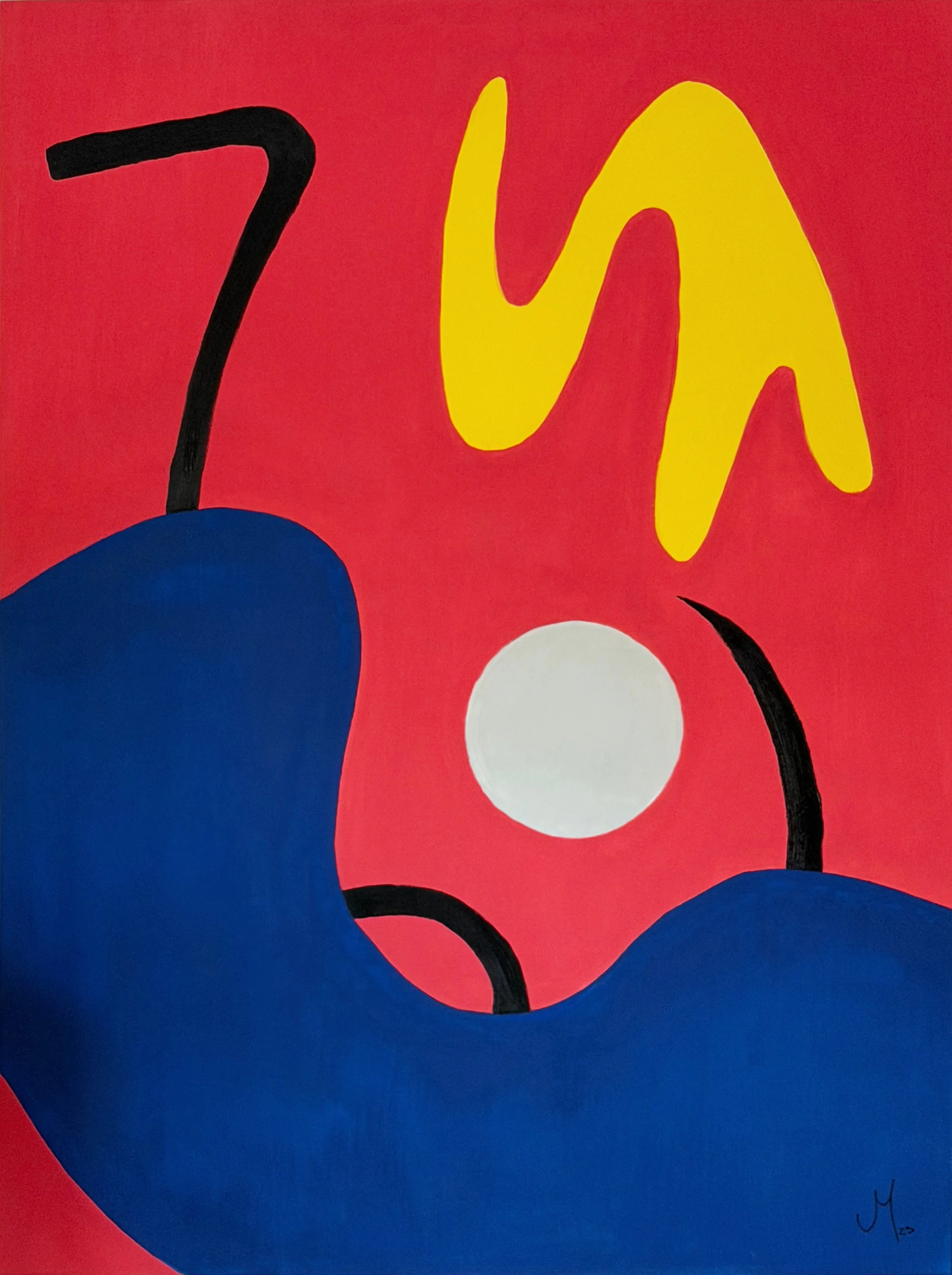
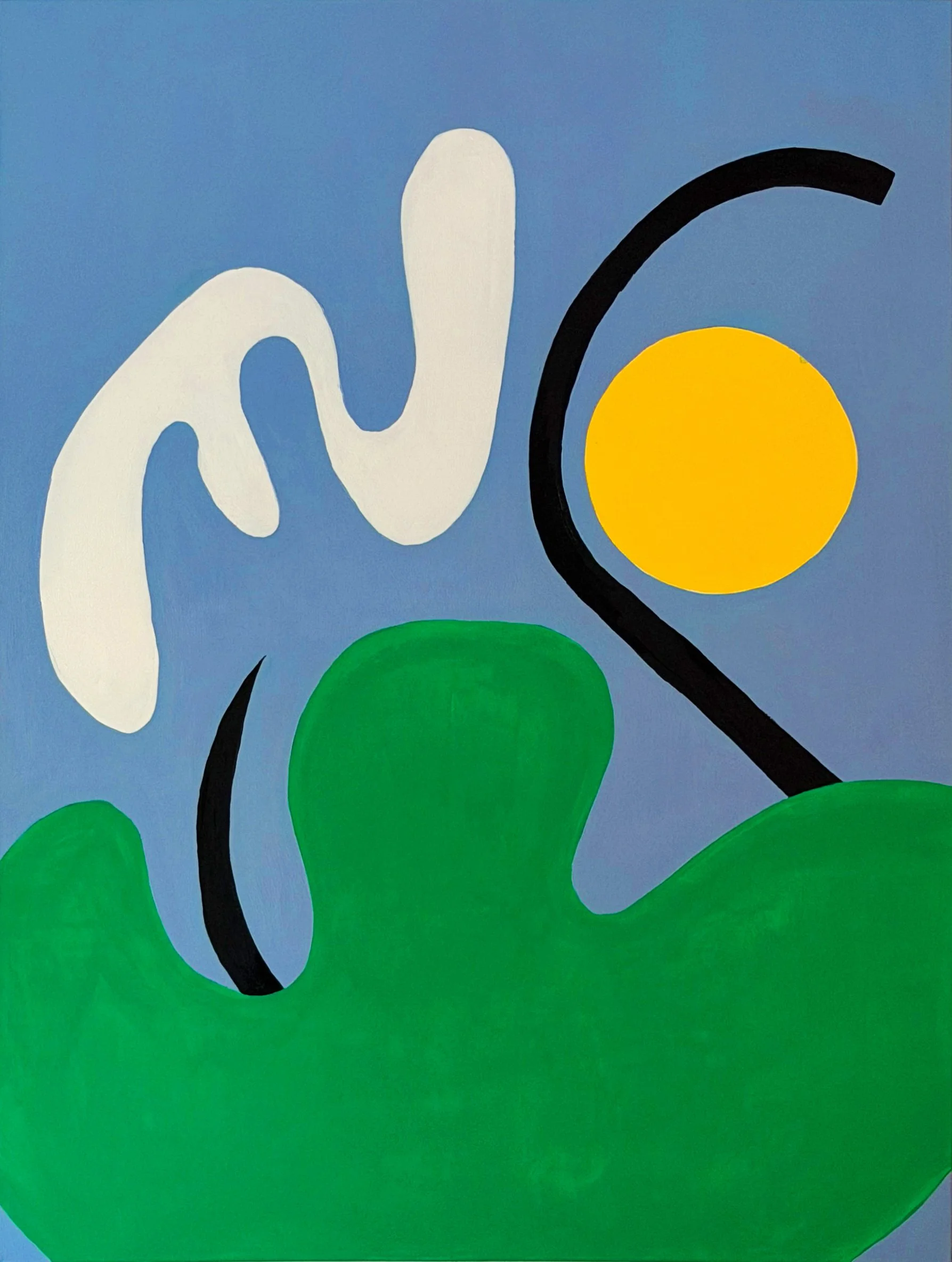
A diptych inspired by the birth cities of my wife and me: LIMA and TEGUCIGALPA. Through minimal abstract forms and characteristic color palettes, both paintings translate the emotional landscape of each city into a simple, personal visual language.
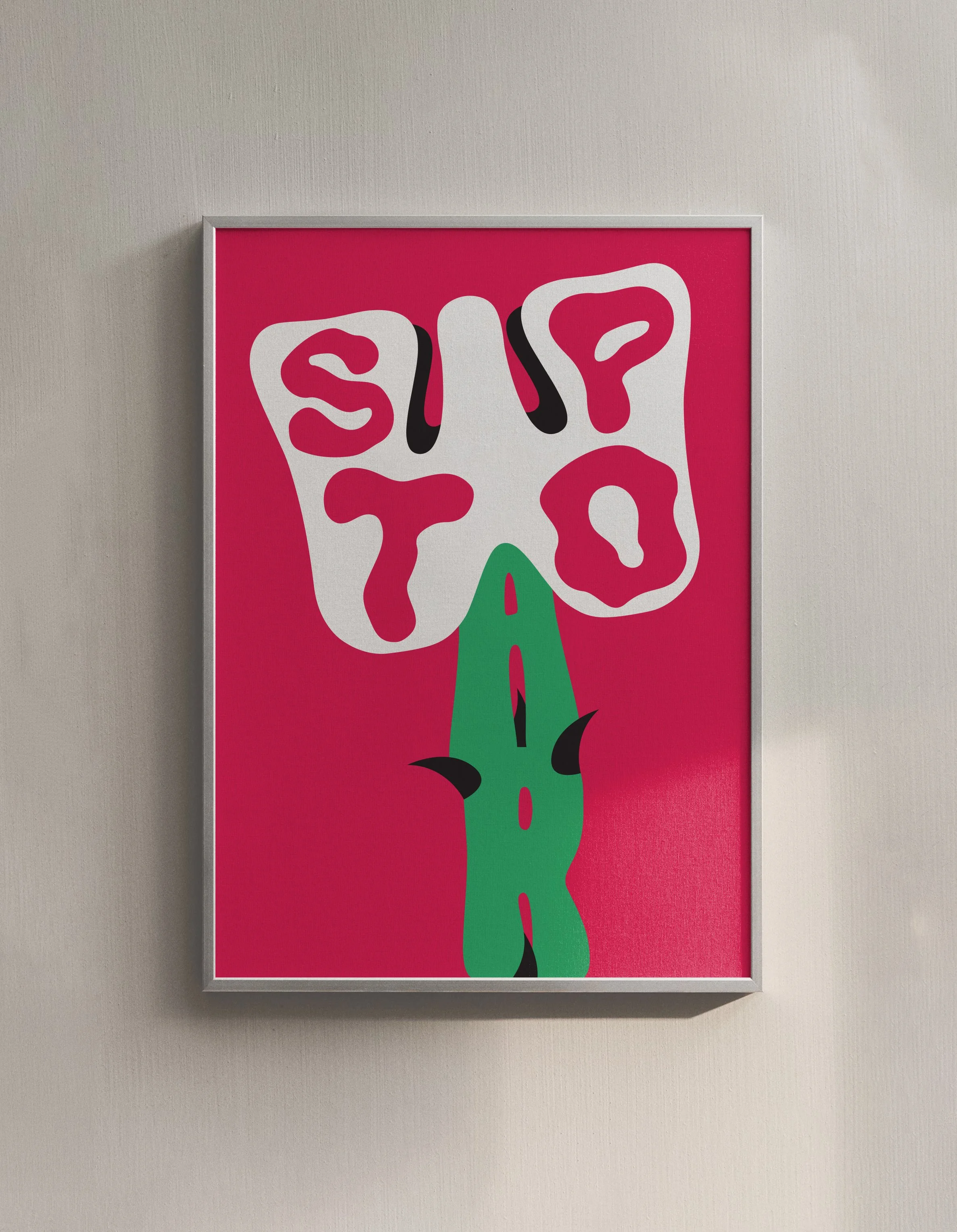
Created in March 2026, as the conflict in the Middle East began to affect the UAE more directly, this poster-style piece turns a flower into an anti-war symbol. Its thorned stem reflects the contradiction behind every war: they may begin under the promise of good intentions, but almost always end in pain, destruction and loss.
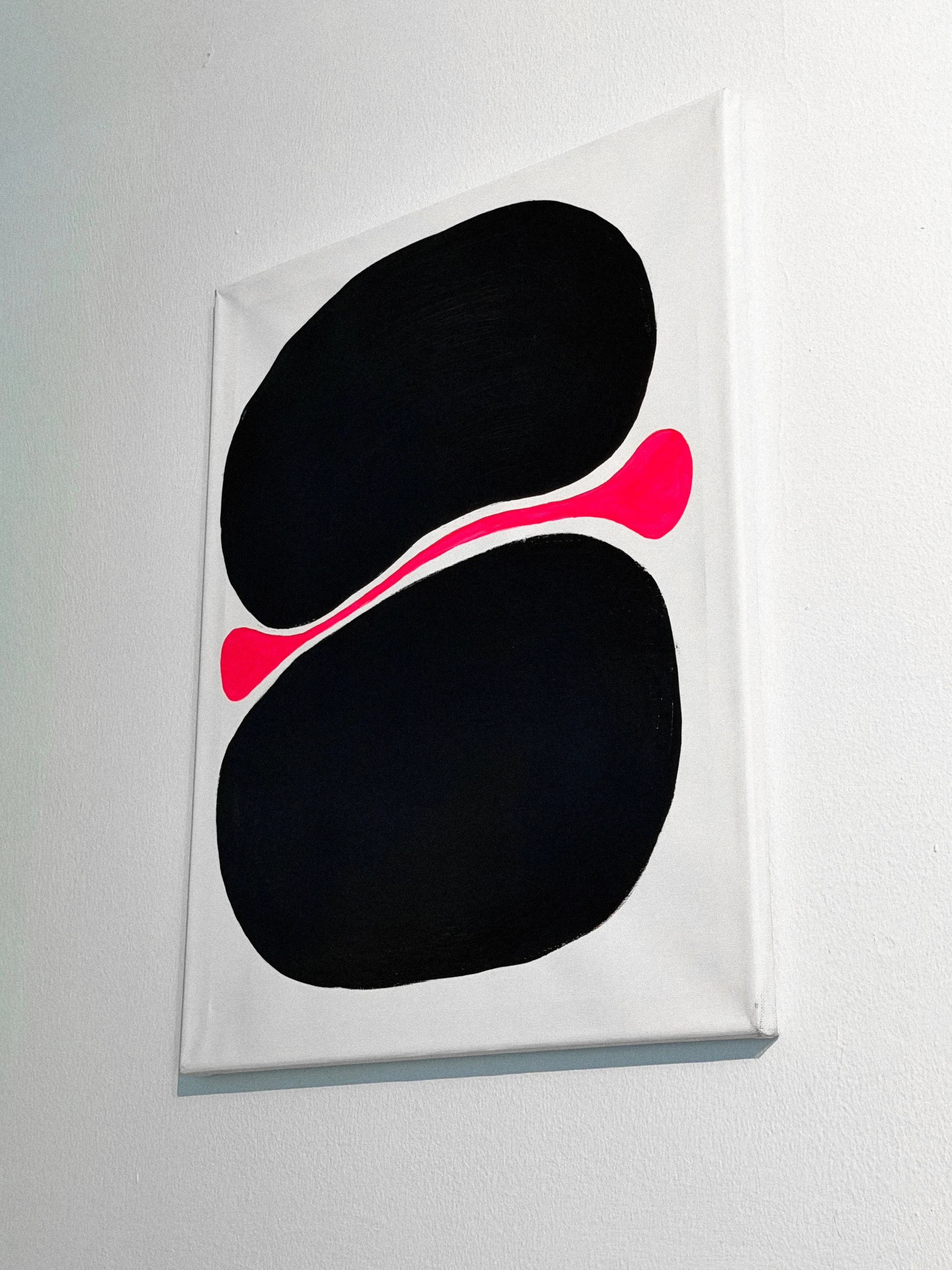
BONE is a piece about marriage and connection, this composition turns two black forms into a symbolic joint, while the red line between them represents love — like a nerve or ligament holding everything together. Inspired by the bond between my wife and me, the piece reflects how partnership works through support, tension, balance and union.
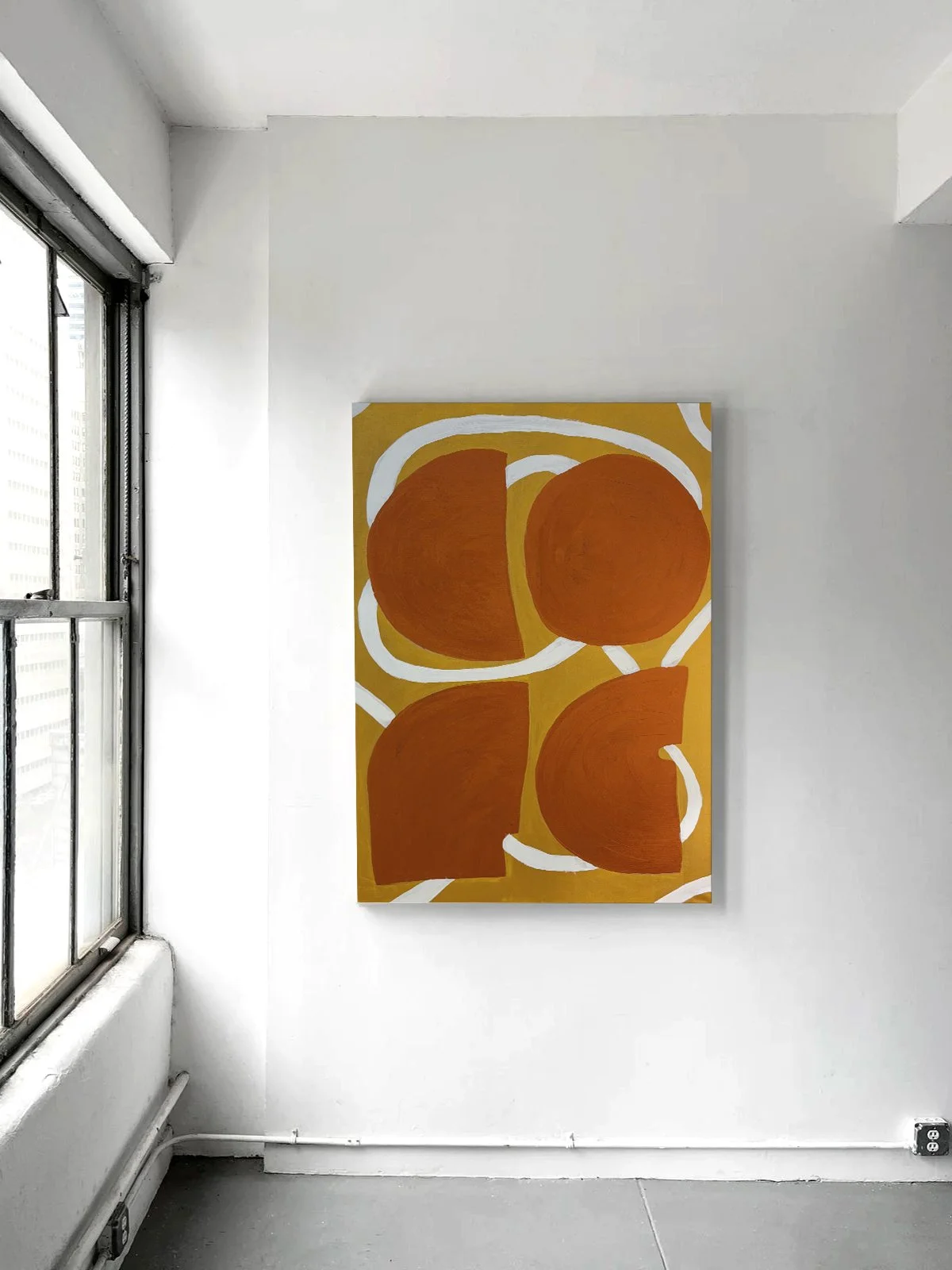
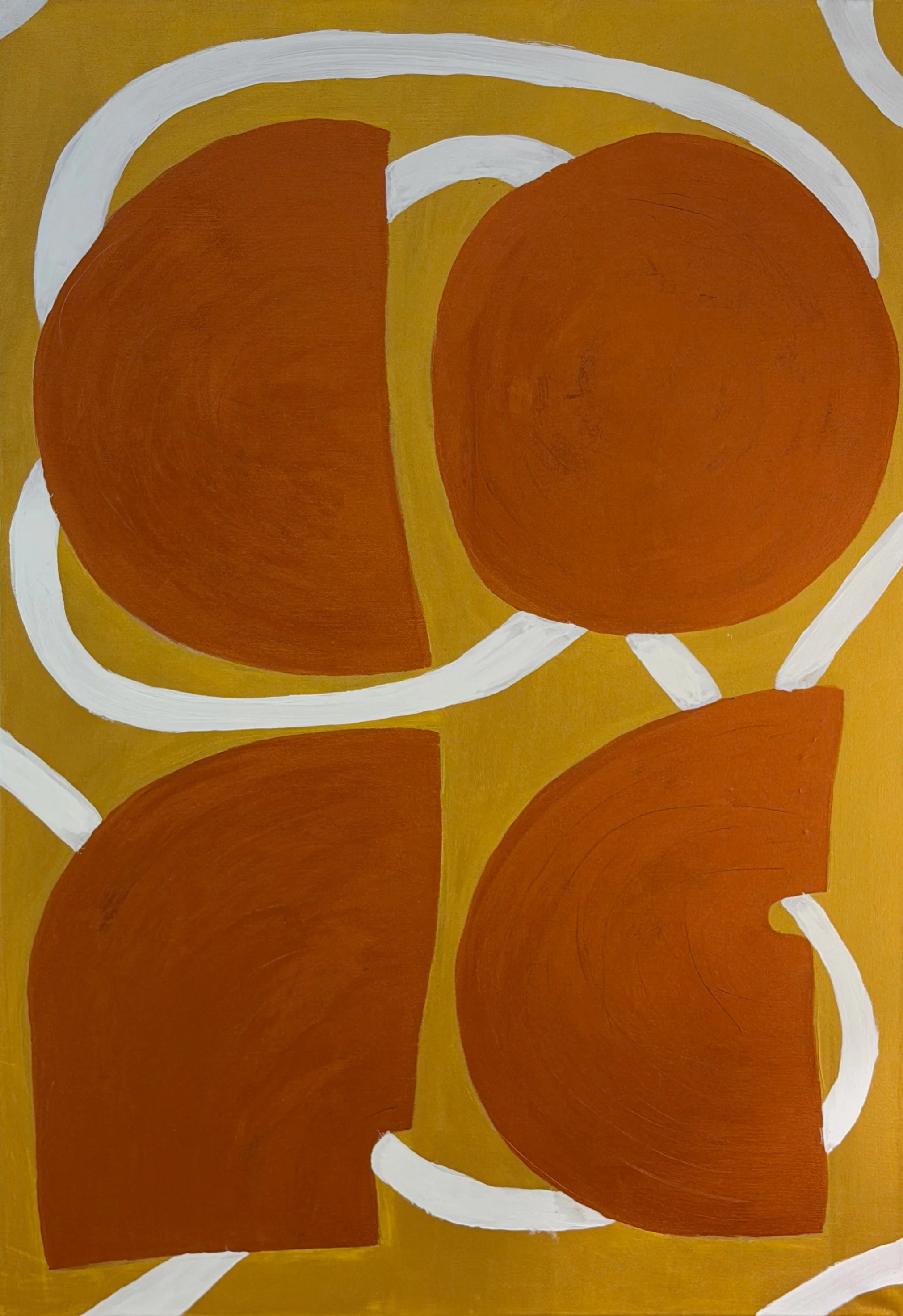
COFE is a tribute to my love for coffee, this piece transforms its warmth, aroma and everyday ritual into a composition of earthy tones, rounded forms and flowing lines. Rather than representing coffee literally, it captures the comfort, rhythm and emotional familiarity that come with every cup.
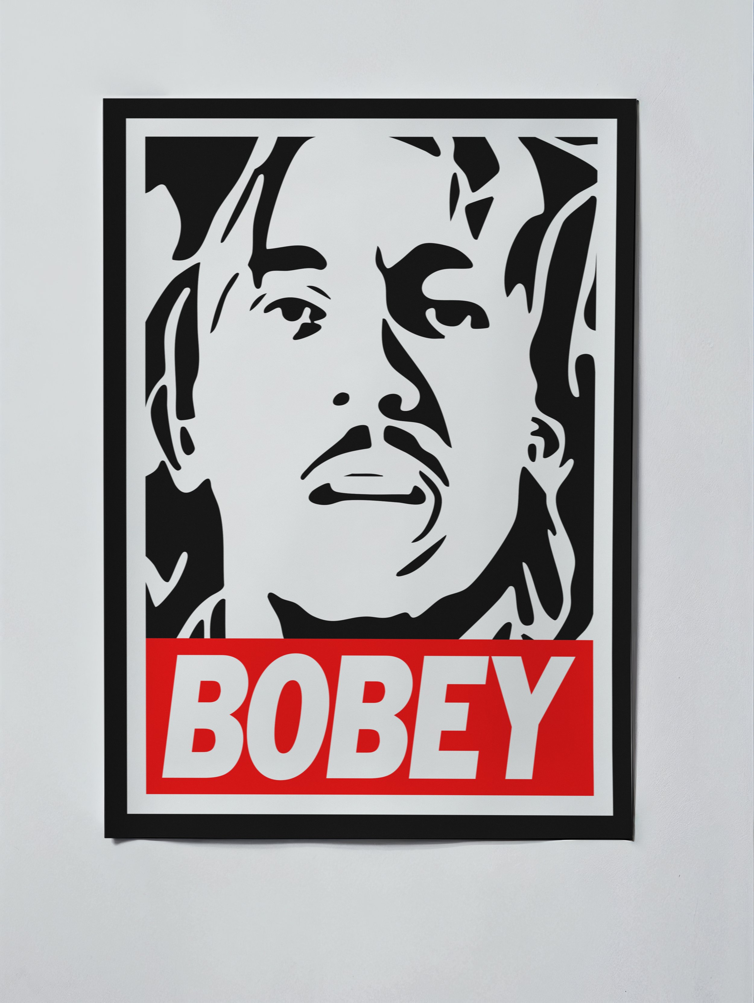
BOBEY is a graphic tribute to Bob Marley built from the visual language of the iconic Obey poster style. By adding a single letter and reworking the familiar format around Marley’s portrait, the piece becomes a playful act of visual appropriation — blending street culture, pop iconography and homage into one bold composition.
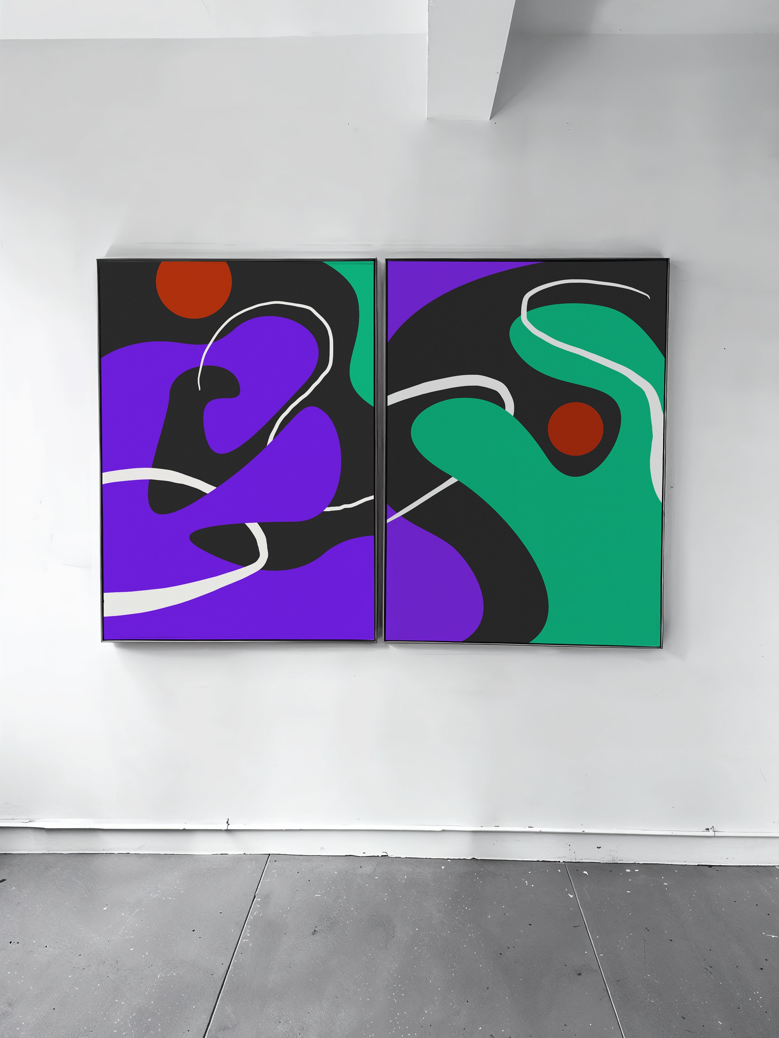
DANCING is a diptych inspired by dance movements. Organic shapes, bold colors and flowing lines create a visual choreography, turning rhythm, direction and gesture into a graphic composition.
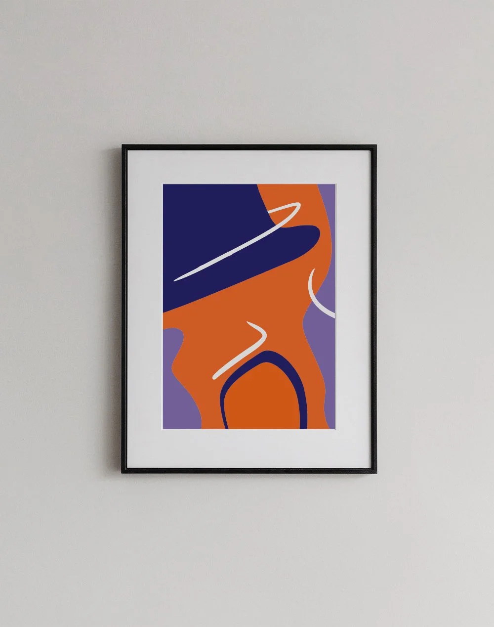
JOAQUINITO is a personal tribute to Joaquín Sabina and to the music my father passed on to me. Through warm colors, abstract forms and flowing lines, the piece evokes childhood memories, familiar songs and the emotional places music allows us to return to.
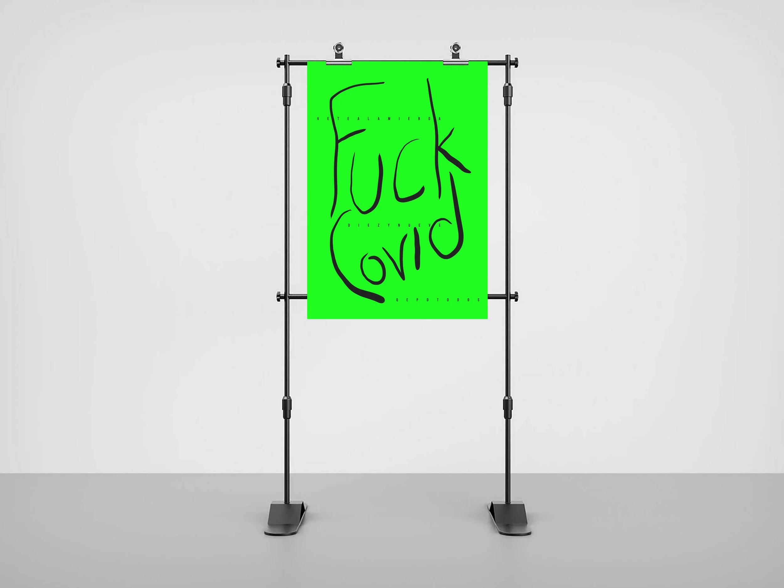
Created during the pandemic, this typographic poster was a direct expression of the anger, fatigue and frustration caused by the virus. With its raw handwritten style and confrontational message, the piece captures the emotional exhaustion of a moment that affected the entire world.
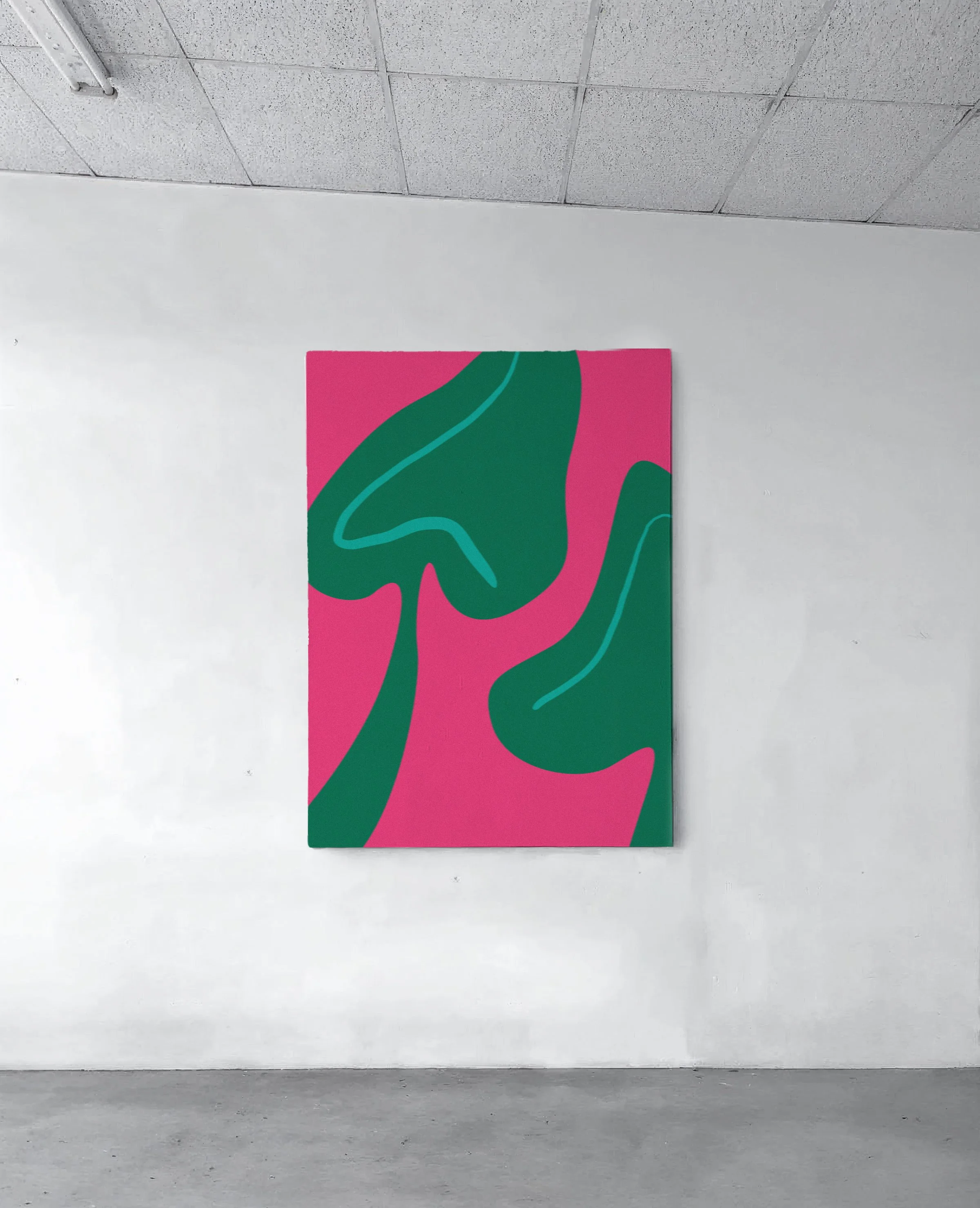
SERES is an abstract interpretation of two elephant ear leaves from my home in Chilca - Lima - Peru, my favorite place in the world. Inspired by the love for plants my mother passed on to me, the piece turns an everyday plant into two quiet beings. She still cares for the plants I left behind when I moved abroad, making this work a small tribute to nature, memory and a living legacy we share.
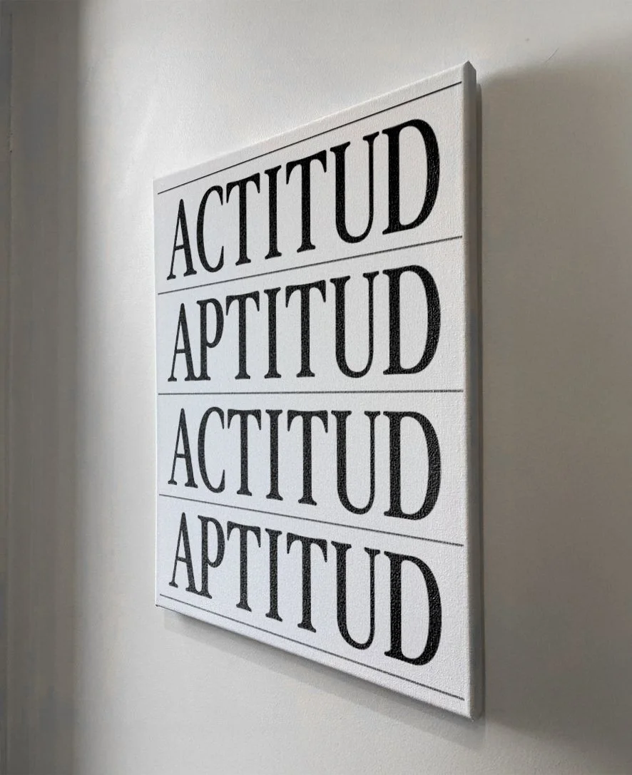
A typographic piece based on the relationship between the Spanish words actitud and aptitud, which differ by just one letter yet complement each other powerfully. Inspired by a lesson my father taught me early in life, the work reflects a simple belief: you can have all the aptitude in the world, but without attitude, you have very little.