Danlac Rebranding
Danlac is a young Peruvian dairy brand with a strong local presence, but its packaging needed a clearer, more contemporary system to help the product line feel unified, natural and premium.
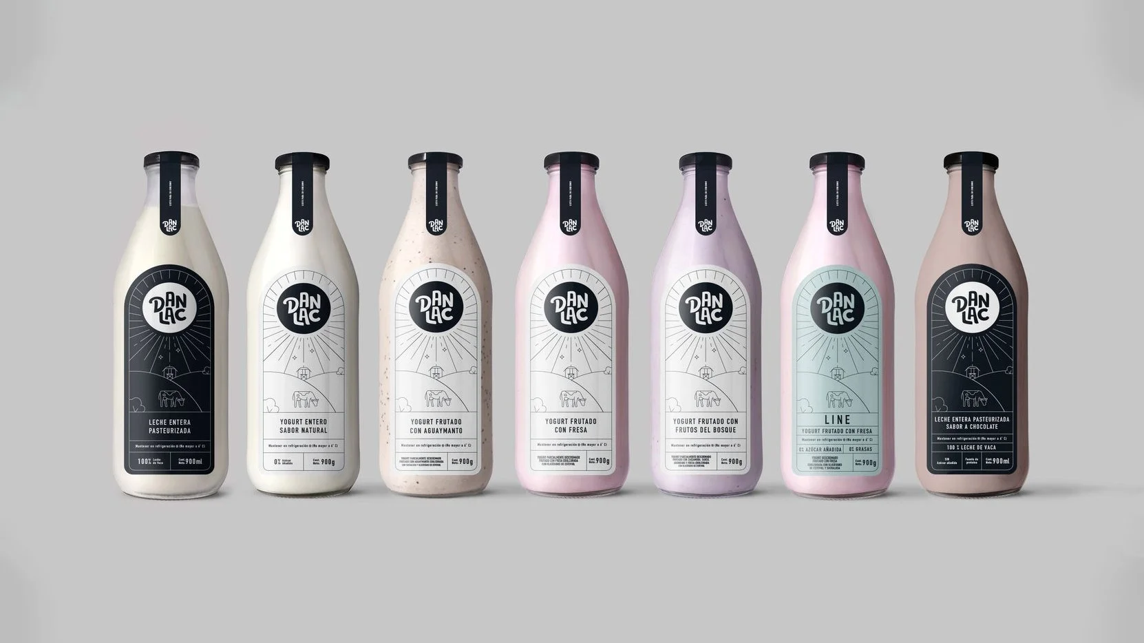
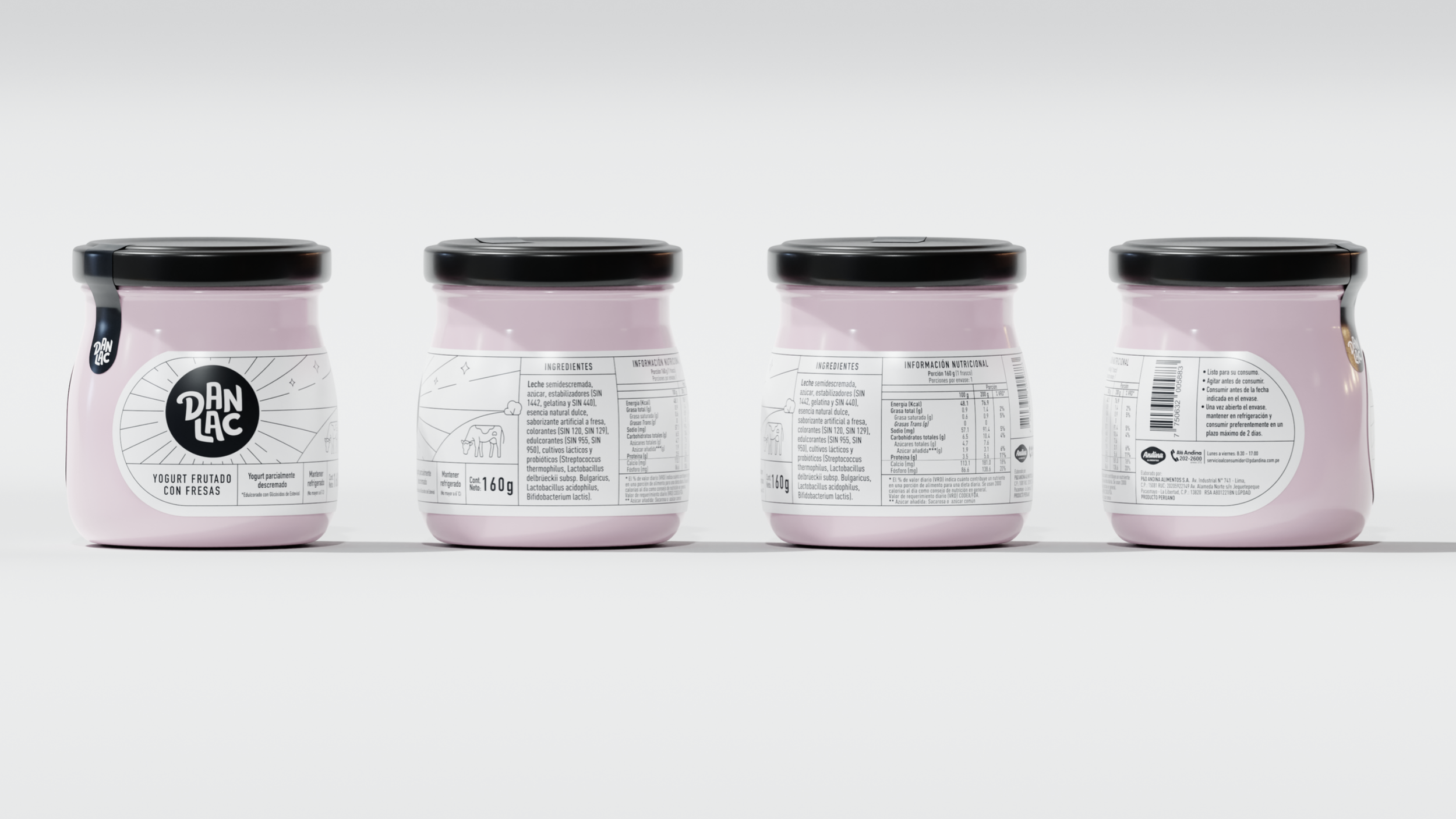
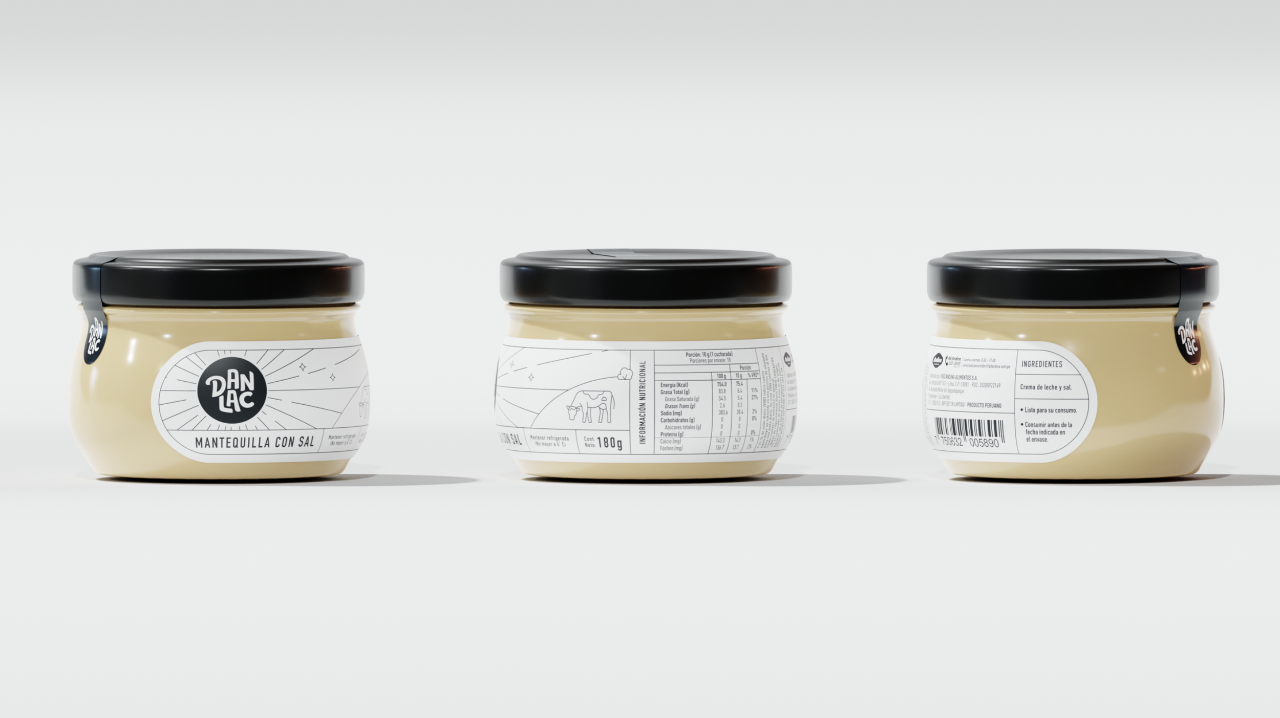
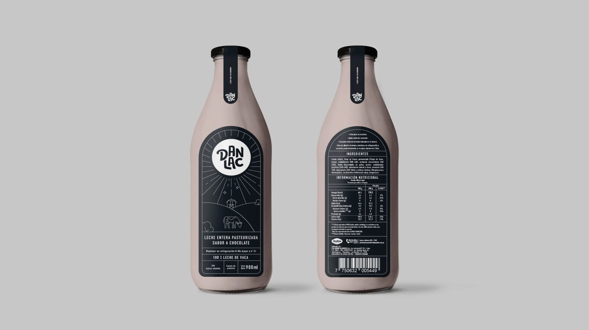
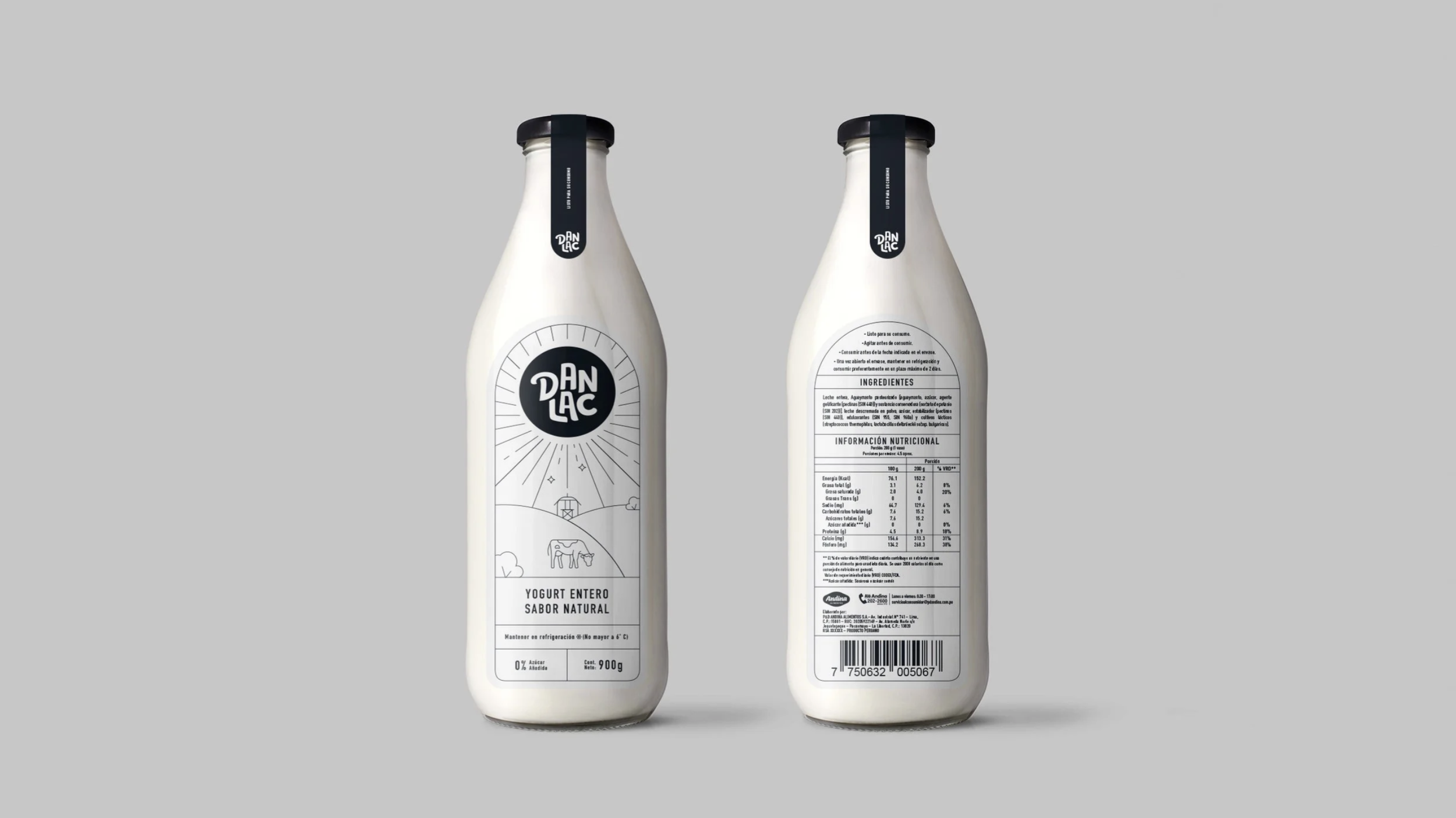
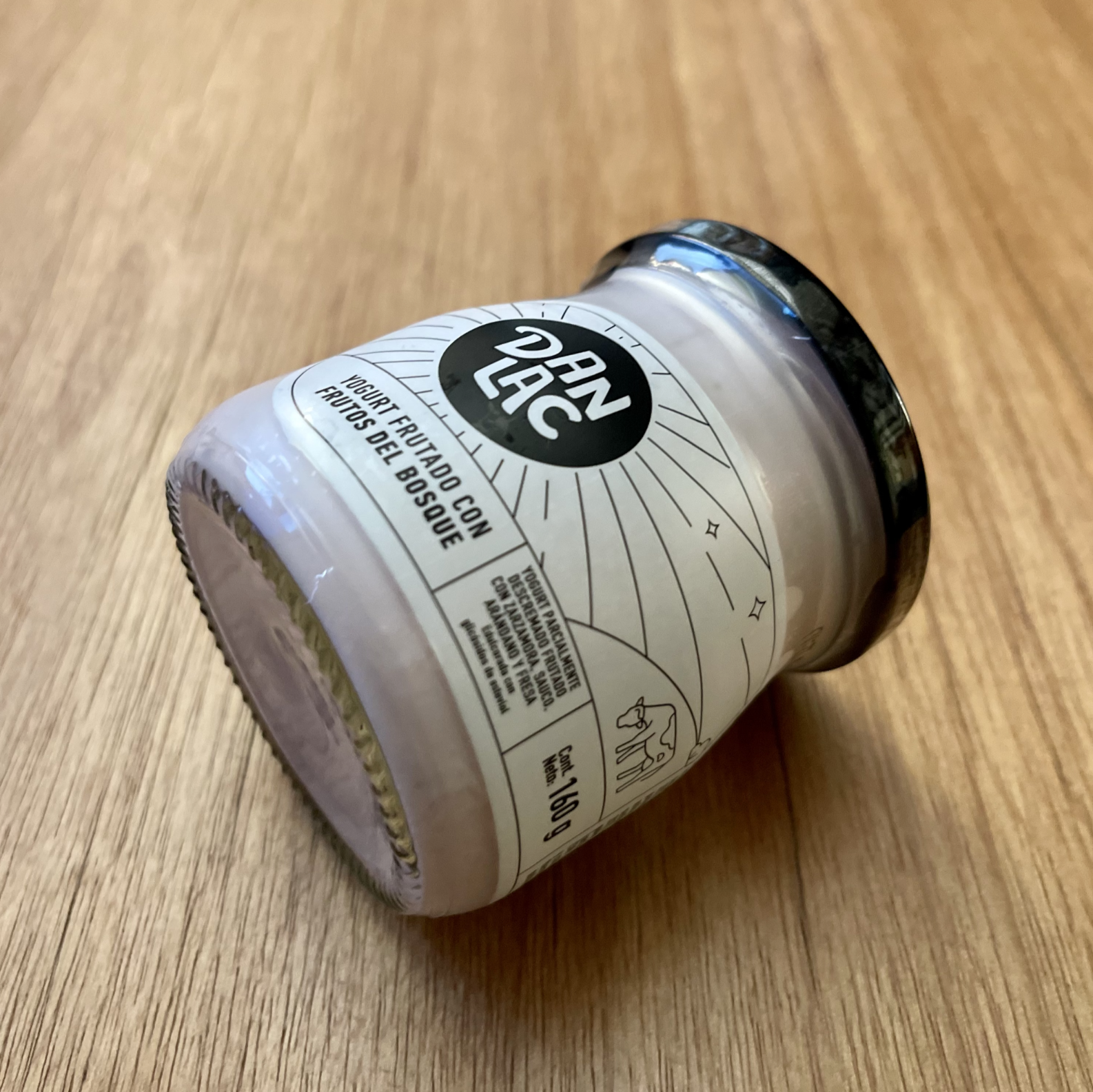
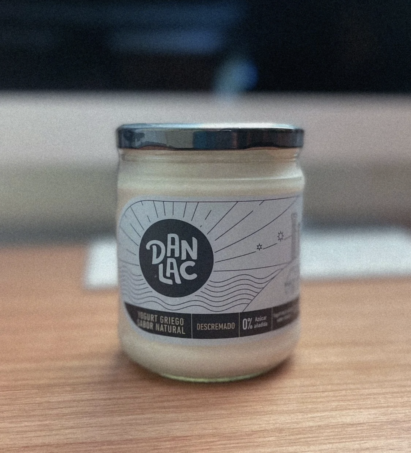
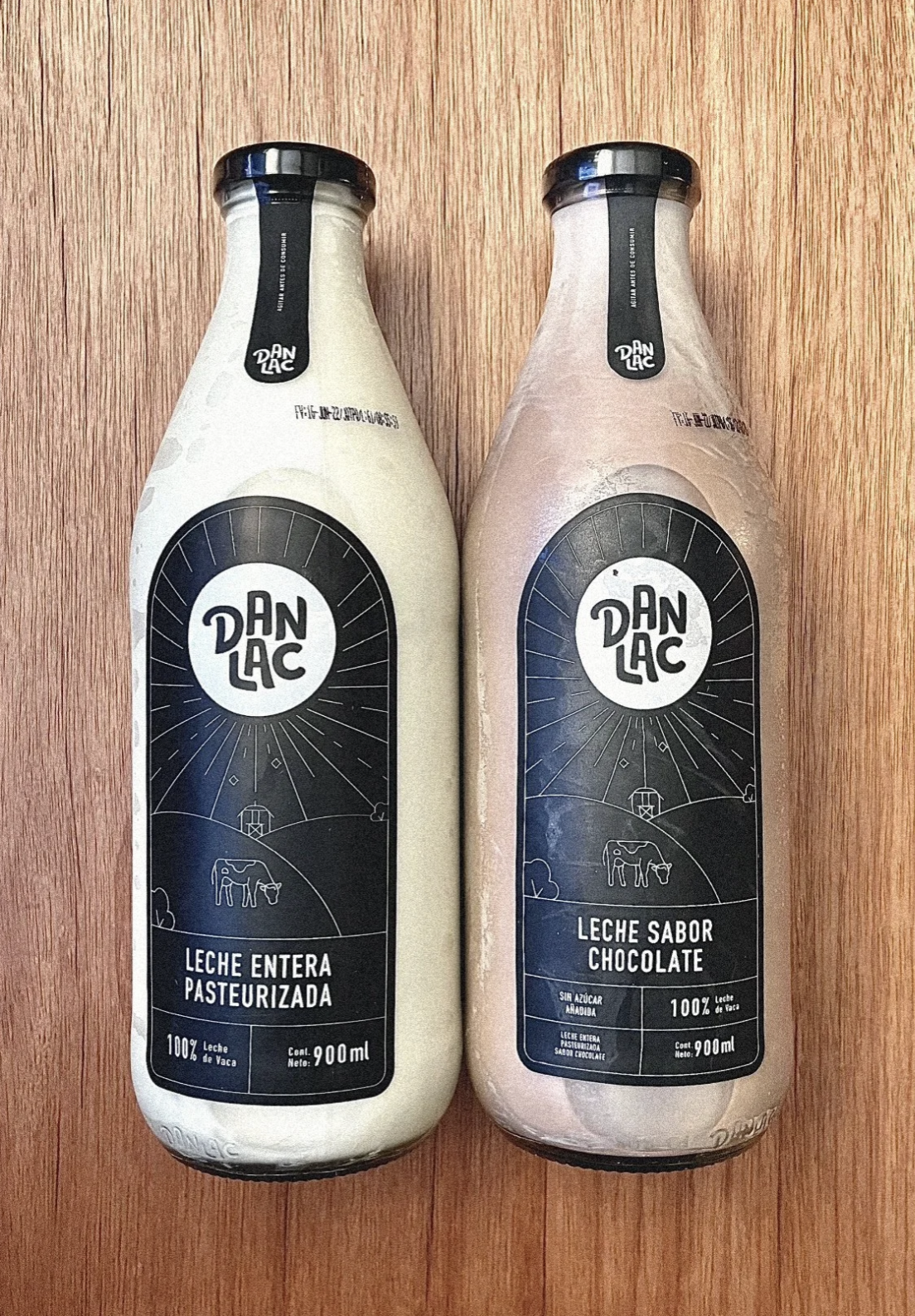
The rebranding focused on bringing simplicity, consistency and craft to the brand’s visual world. The new packaging system was built around a clean black-and-white label inspired by rural landscapes, sunlight, cows and the origin of the product. This created a visual language that felt honest, fresh and connected to the natural character of dairy.
Each product kept its own personality through the color and texture of the liquid itself, allowing the milk, yogurt and flavored varieties to become part of the design. Instead of relying on excessive graphics, the system used restraint: a strong logo, minimal illustration, clear hierarchy and a flexible label structure that could work across bottles, jars and different product formats.
The result was a cohesive brand family that made Danlac feel more modern without losing its warmth, simplicity and everyday authenticity.