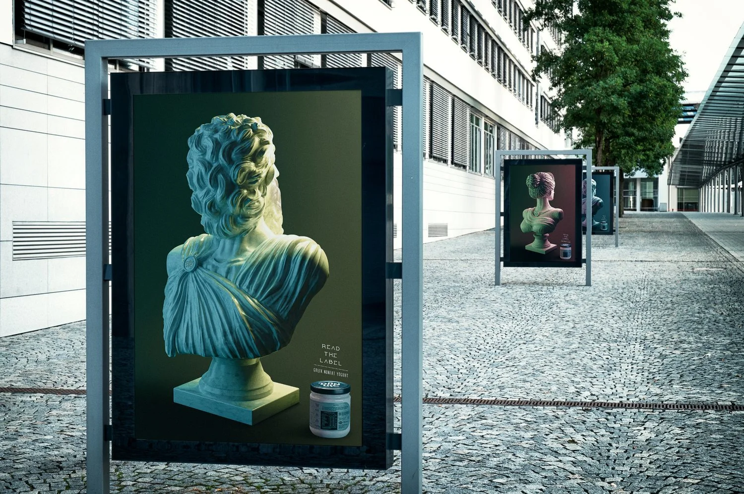
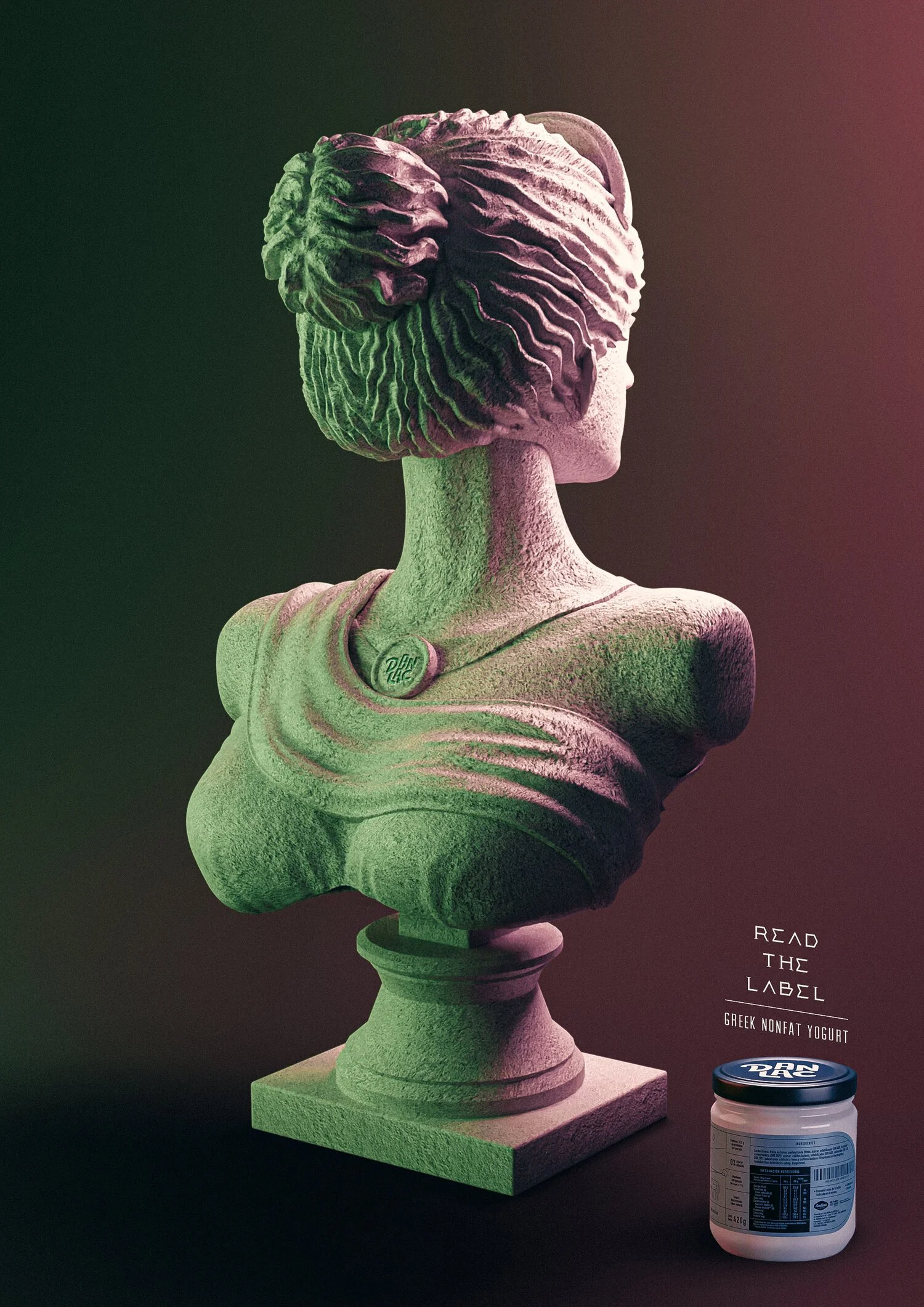
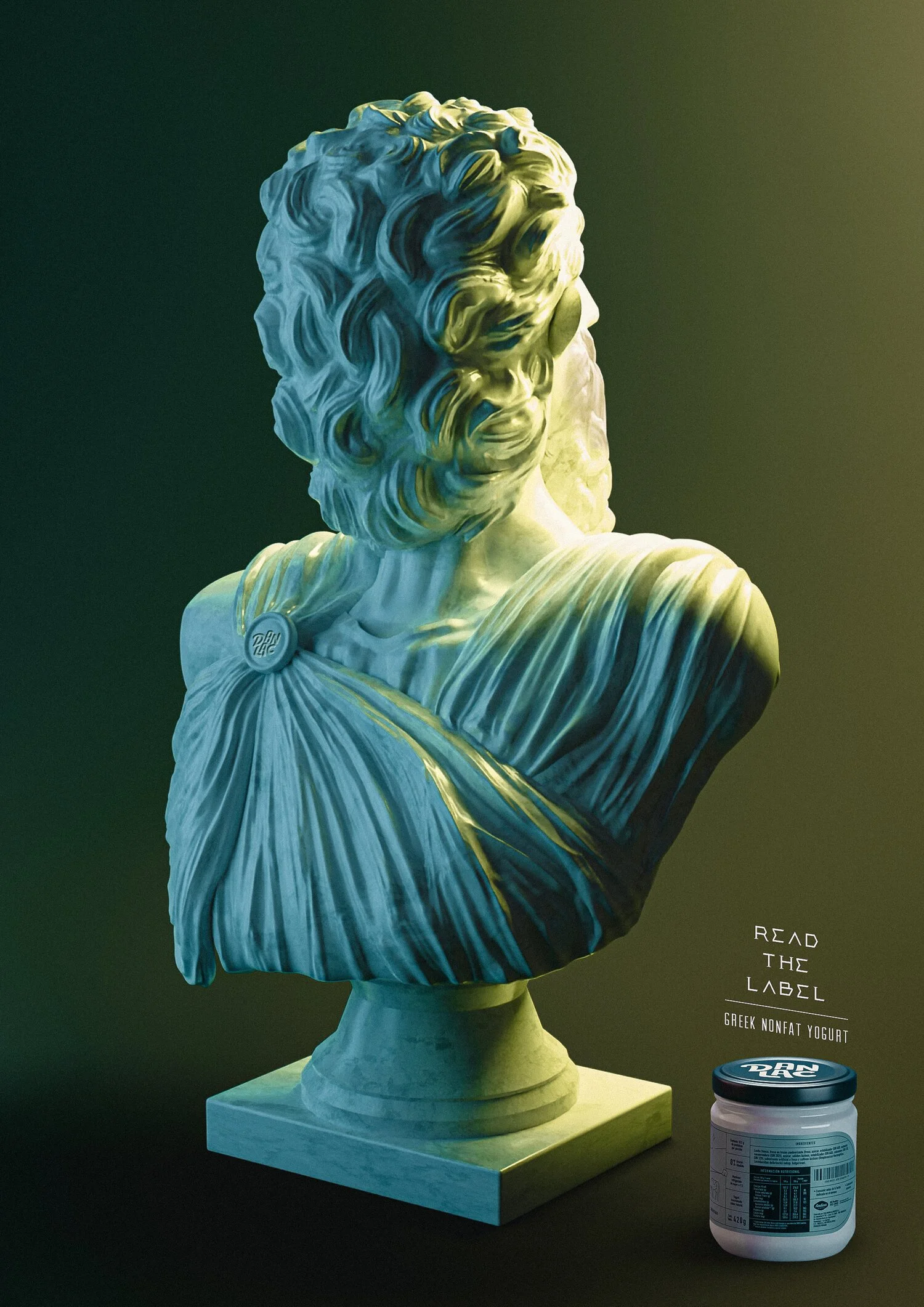
Read The Label - Danlac
We invited consumers to pay attention to the side of the packaging they almost never read: the nutrition facts. To bring the idea to life, we created a visual campaign inspired by ancient Greek busts, connecting directly to the product’s Greek yogurt origin. But each sculpture had an unexpected twist: their heads were turned to the side, as if even these classical Greek figures were looking at the label. The gesture became a simple and memorable way to dramatize the message — when a product has nothing to hide, the smartest thing you can do is read what is written on the pack.
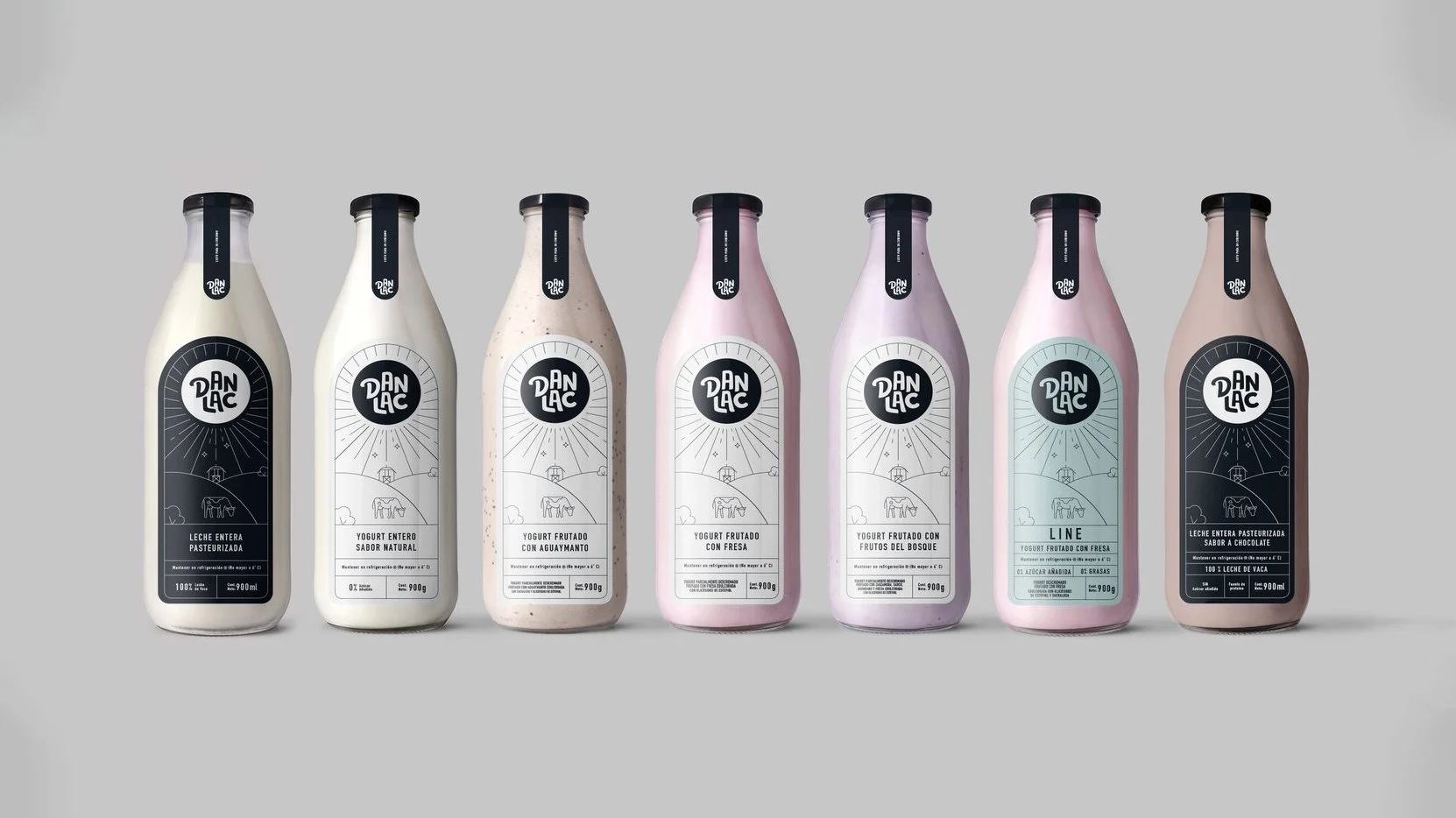
The campaign also served as the launch platform for the new Danlac product line branding. The redesigned packaging gave the brand a cleaner, more premium and transparent look, making the label itself part of the communication. Instead of relying only on claims, the idea used design, nutrition and honesty as proof. In a category full of promises, Danlac asked people to look closer.